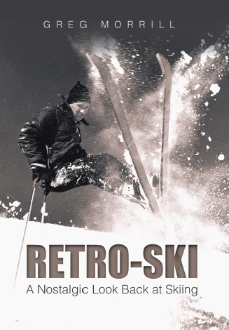
The Vermont Ski and Snowboard Museum’s current exhibit is “The Art of the Graphic” and features the work of graphic designers for skis and snowboards. It’s a beautiful exhibit worthy of an art museum. If you haven’t seen it, you have until October to check it out.
Most of the exhibited work is relatively recent. This is driven by the emphasis on making skis unique and beautiful, particularly the top sheets. For example, Jason Levinthal’s J-Skis are known for spectacular graphics which are produced in limited numbers. So your skis have a certain uniqueness shared by only a couple hundred people in the U.S. or the world for that matter. And they are not just pretty faces, they are well-designed functional skis as well.
As a Retro-Skier I tend to say “who cares what they look like as long as they ski well!” But the fact is, we were influenced by graphic design even in the Retro-Ski days. So what were some of those eye-catching skis from those days?
I’m actually waiting to hear from some of you readers on this topic. But I’m going to go ahead and give you my top 5 ski graphics.
Number 5: The original Head skis. Wait a minute, I heard you say, they were just black! Somehow that black surface just exuded class! I never owned a pair of Heads, but I drooled with envy in many lift lines next to someone on those metal beauties. And then there’s the Head logo. Logos are a component of the graphic design. That Head logo was so good that it’s still used on today’s Heads! That’s about the only connection between the skis Howard Head designed and today’s Head skis. The logo was so good they even used it on tennis rackets.

Number 4: The Kneissl star series. Unlike Head, Kneissl introduced some color into the scheme. They had the top of the line White Star, then the Red Star, and I think they even had a Blue Star. The White Star was a favorite among racers. Once again the logo played a part with the star on the tip emphasizing the theme. I’m not sure what ever happened to Kneissl. You don’t see many of their skis around although they still make them. They’ve modified their star logo somewhat as it now looks like those insignias they used on Star Trek uniforms!
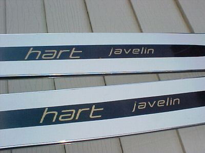
Number 3: Hart Javelin. I’m prejudiced here since I actually had a couple pairs of these. I was greatly influenced by the movie “The Incredible Skis” which featured two of my skiing idols Art Furrer and Roger Staub. The black-and-white motif reminded me of a tuxedo. I literally felt that I skied better because of the way they looked! A few years ago when Hart put out a modern ski with the Javelin graphics, I almost bought a pair!
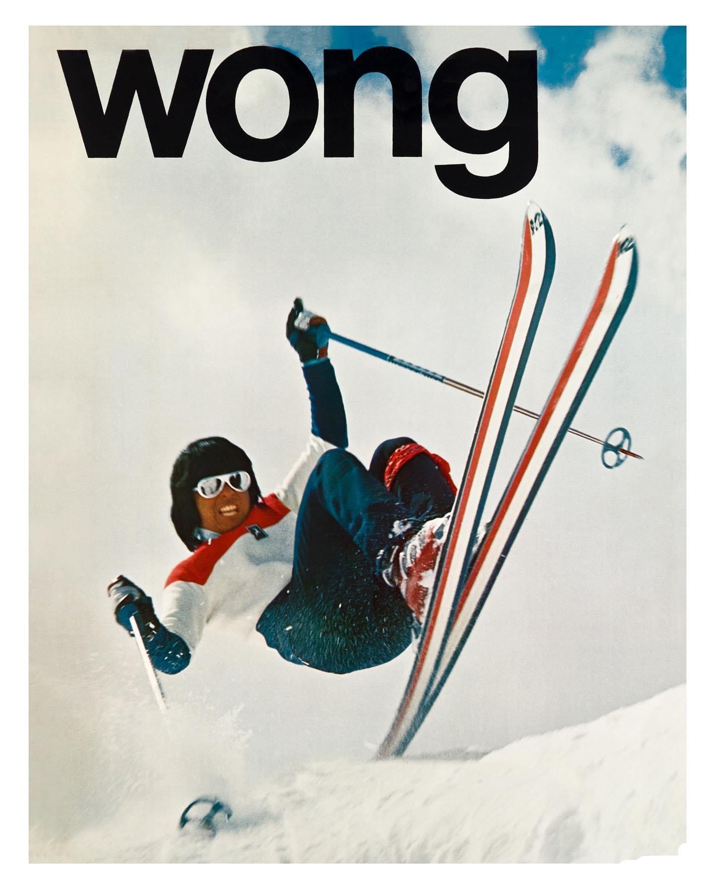
Number 2: Red, White, and Blue K2s. These signaled the beginning of the freestyle era. Patriotic, yes, but flashy rather than classy. The K2 demonstration team consisted of some of the best hotdoggers of the day. I mentioned Wayne Wong’s iconic 1972 photo last week of him jetting off a mogul with his tricolor K2s.
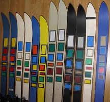
Number 1: The Ski. I’m not sure The Ski ever had great commercial success, but I still think they had one of the best ski graphics ever! To my non-artistic eye it combined classy and flashy. Freestyler Bobbie Burns was both the technical and graphic designer of these skis. Technically he designed a light, soft ski using sagebrush as the core. For the graphic design, Burns found his inspiration from Scott boots. He used the available Scott boot colors in blocks on the ski’s top sheet. There was no logo or name on the ski and it was appropriately named “The Ski.”
Bobbie Burns is 86 years old and still skis at Sun Valley where he has lived for over 60 years. He was inducted into the U.S. Ski and Snowboard Hall of Fame in 2020. Before going out on his own as a ski designer, he worked for K2 designing competition skis, including the skis used by Marilyn Cochran when she won her first World Cup GS.

April 8, 2022 at 8:56 pm
Northland had the Deer head logo on tips .
February 10, 2023 at 1:14 pm
Did not see this when originally published – surprised there aren’t a number of retro-ski geeks sounding off on faves from the 60’s and 70’s. My number one graphic from the old days was the original Volkl Zebra (and Tigers). Bright orange Spaulding Siderals. I think Head had a “tri-color” striped key similar to the K2 with different colors (red-orange-yellow?) that was all plastic that might not have been ready for prime time as they had some issues. I think they might have been Head “XRP’s” – call the historian to check on this. Don’t think the “white” skis count much for graphics – it’s like a ski waiting for graphics to happen. Having just said that I would have not not turned down a pair of White Stars (I think Karl Schranz skied them) or Hart “Comp USA’s (Billy Kidd). I had a pair of Dynastar Equipe “MV2’s” (1960’s French ski team issue) . In the 70’s everything went neon.